Redesigning a NASDAQ listed Life Science's company's checkout flow
I redesigned Abcam's checkout flow during their digital transformation and integration with Oracle.
Notable results from the project
-35%
Reduction in offline orders
1.5pts
Increased conversion
1000s
Customer data cleaned

Industry
Lifesciences
Headquarters
Cambridge
Founded
2020-2024
Company size
1500-2000
Abcam Limited is a producer, distributor and seller of protein research tools operating worldwide from 13 locations with 1,800 employees of which 400 work in Research and Development (R&D). Abcam was listed on the Nasdaq and the London Stock Exchange until it was acquired by Danaher Corporation in 2023.
– Wikipedia
At Abcam, I was leading UX capacity for a few squads which were part of a larger product team, each responsible for a vertical in product feature set.
Due to Abcam's world-wide presence, there were multiple sales channels actively bringing orders and some were still off-line. Customers were still placing orders via email, phone and even facsimile.
The brief was simple, but the answer was complex: As e-commerce team, we had to create a checkout flow in a way that it'd break users' "habits" with it's convenience and ease of use.
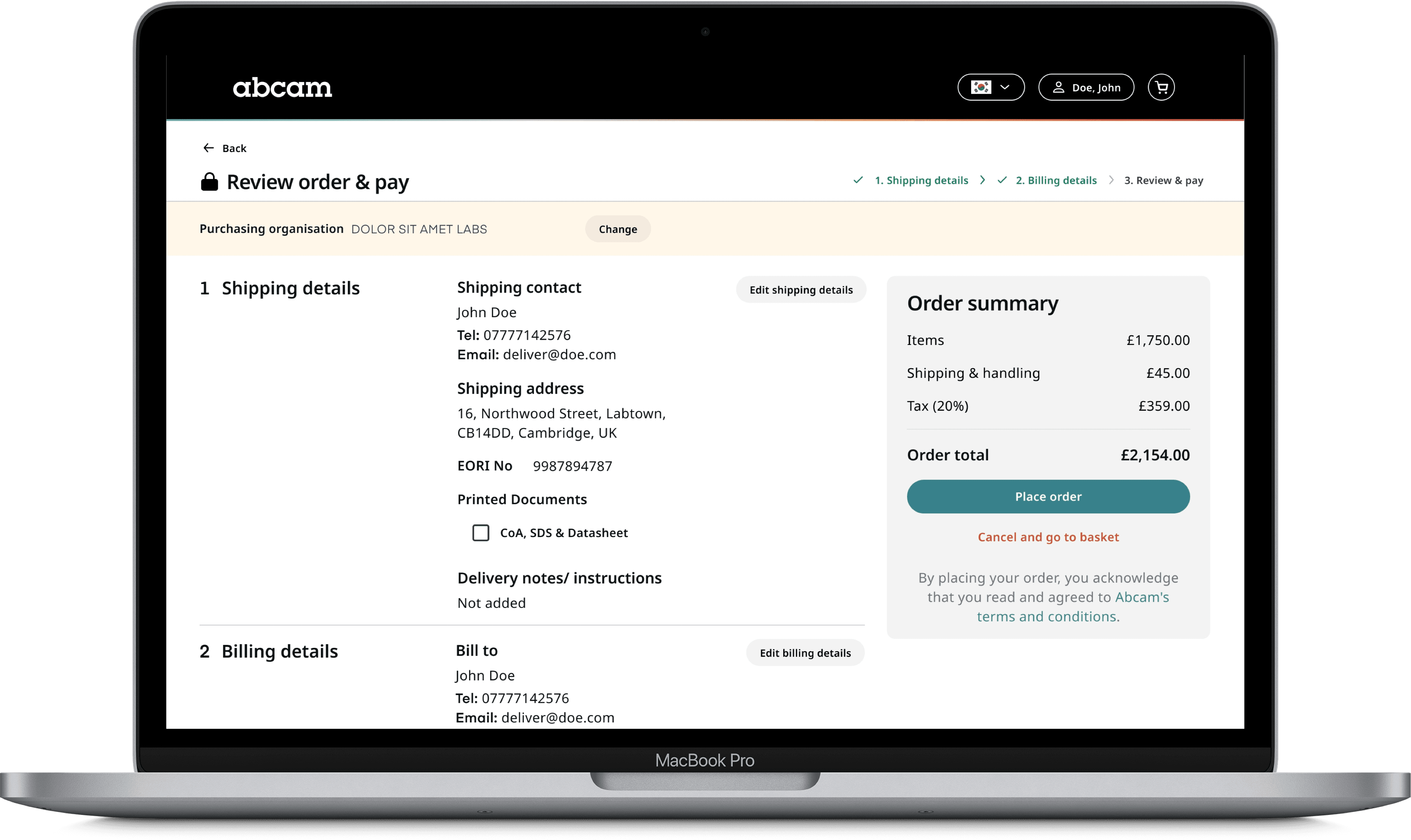
After a period of discovery, meetings and wire-framing, working closely with PM and lead engineers, we've devised a user-flow and designed a single page checkout flow that removed all the convoluted steps in older website, which was confirmed with the regular user interviews.
Once the flow was tested with the users, I started working on final UI designs of the pages from shopping basket to thank you page, including buy-box in the product page.
Due to complexity of the products specifications, and the nature of life-science products it was crucial to display clear information with easy to see sign posting. All UX copy was written by our own UX-Writer.
But, complex data-schemas were not helping us.
Soon after, saving user preferences during checkout was found to be an issue due to strict limitations of Oracle and API integrations which mean that users will have to enter (or select) shipping and billing information each time they checkout, regardless of their logged in status.
I had to redesign a solution I already tested and validated with stakeholders and users.
It didn't take too long to devise another user flow and create basic mockups to start testing with users. When you have a working design system with all the required components in Figma, it becomes easier and quicker to create good looking prototypes to test with users. While testing continued, I worked on detailing the information we had to get from the users during checkout.
Despite our thoughts user testing results were encouraging, say the least. Users didn't hate the multi-step checkout and found clear and easy to follow.
It took several months to implement the flow completely after I completed the designs and handed over them to developers at Abcam. Being on call and able to answer questions during development was quite beneficial for both parties.
When working as part of a large product team, it is very important to create an alignment and communication channel between different squads where all updates could be shared or features could be aligned.
Ready to Transform Your Digital Platform?
Whether you're dealing with complex user journeys or seeking to improve conversion rates, my proven process can help you achieve measurable results.
Book a free discovery call now.
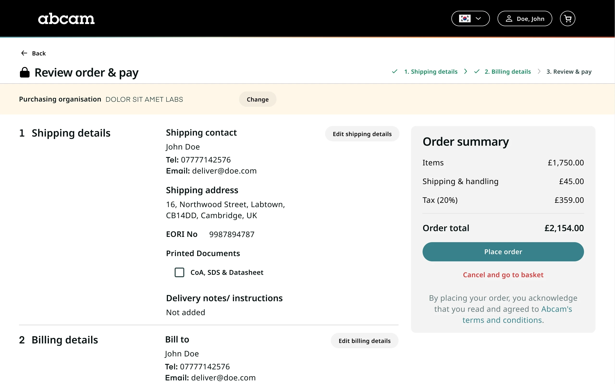
Image Gallery

Schedule a FREE Call
See what they have to say about me
Listen to what my client say